2ND STREET · NYC
Nathalie Pozzi
This small home occupies the top floor of a 1901 building on a lively, tree-lined Manhattan street. Although only 420 square feet, the original layout of the apartment has four distinct main spaces: living room, office, kitchen, and bedroom - in a two-by-two grid in which each room connects to two others. The compact, century-old layout feels inexplicably contemporary.
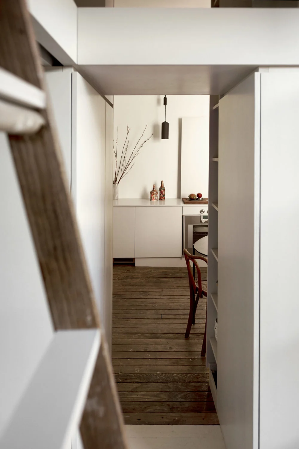
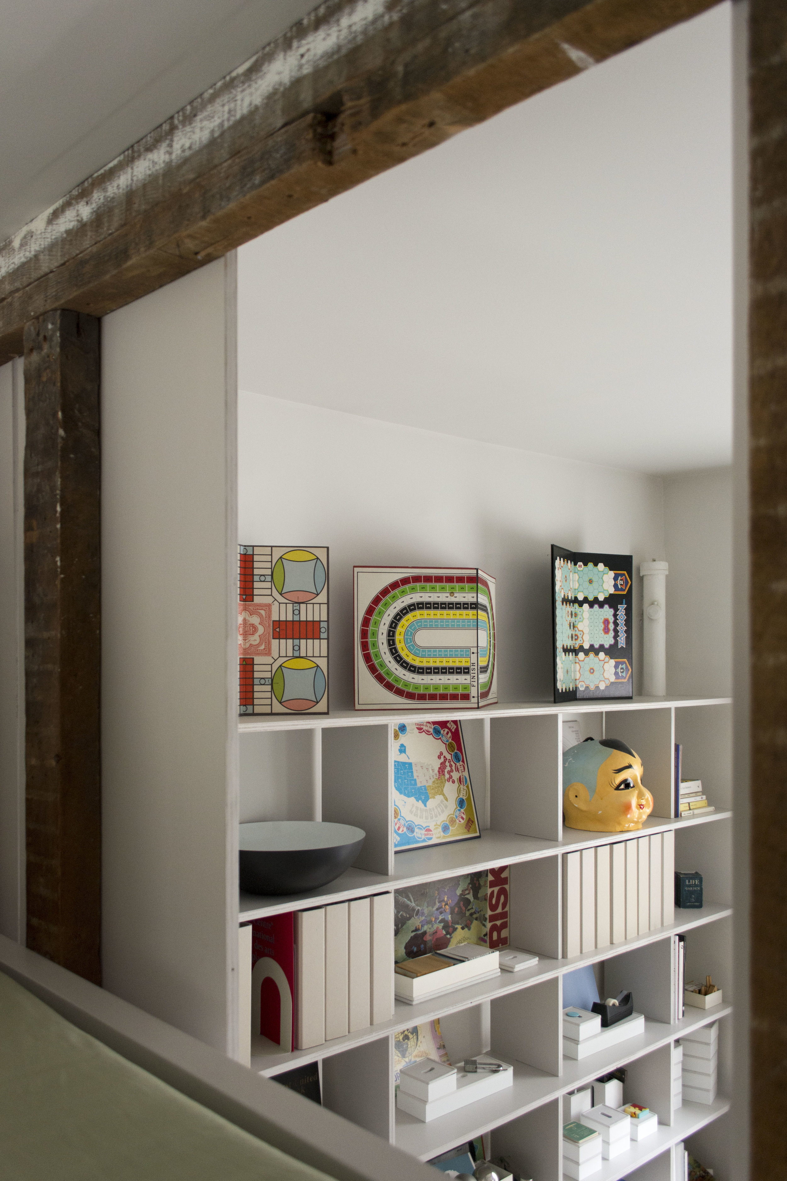
During the interior renovation, this remarkably efficient layout was only minimally modified. And yet, by slightly shifting the position of two passages, the entire usable space was efficiently optimized. A loft bed doubles the available floor space in the bedroom; the kitchen gains room for a table; the small office is expanded vertically, with supplies and documents stacked in a custom vertical shelf system.
In such an intimate space, small details become crucial: the undulating outline of plywood panels along the uneven profile of the walls, hand-cut silhouettes that frame heating pipes, cabinetry that follows the slope of the floor.
These details accumulate in the space, but through their careful arrangement, they somehow disappear, into a narrowness that is calm, open, and serene.
Interior renovation of a 420 Sf apartment
Location
New York City
Year
2018
Carpentry work
Takeshi Miyakawa
"And there is almost no space here; and you feel almost calm at the thought that it is impossible for anything very large to hold in this narrowness."
Rainer Maria Rilke
as quoted in Gaston Bachelard, The Poetics of Space
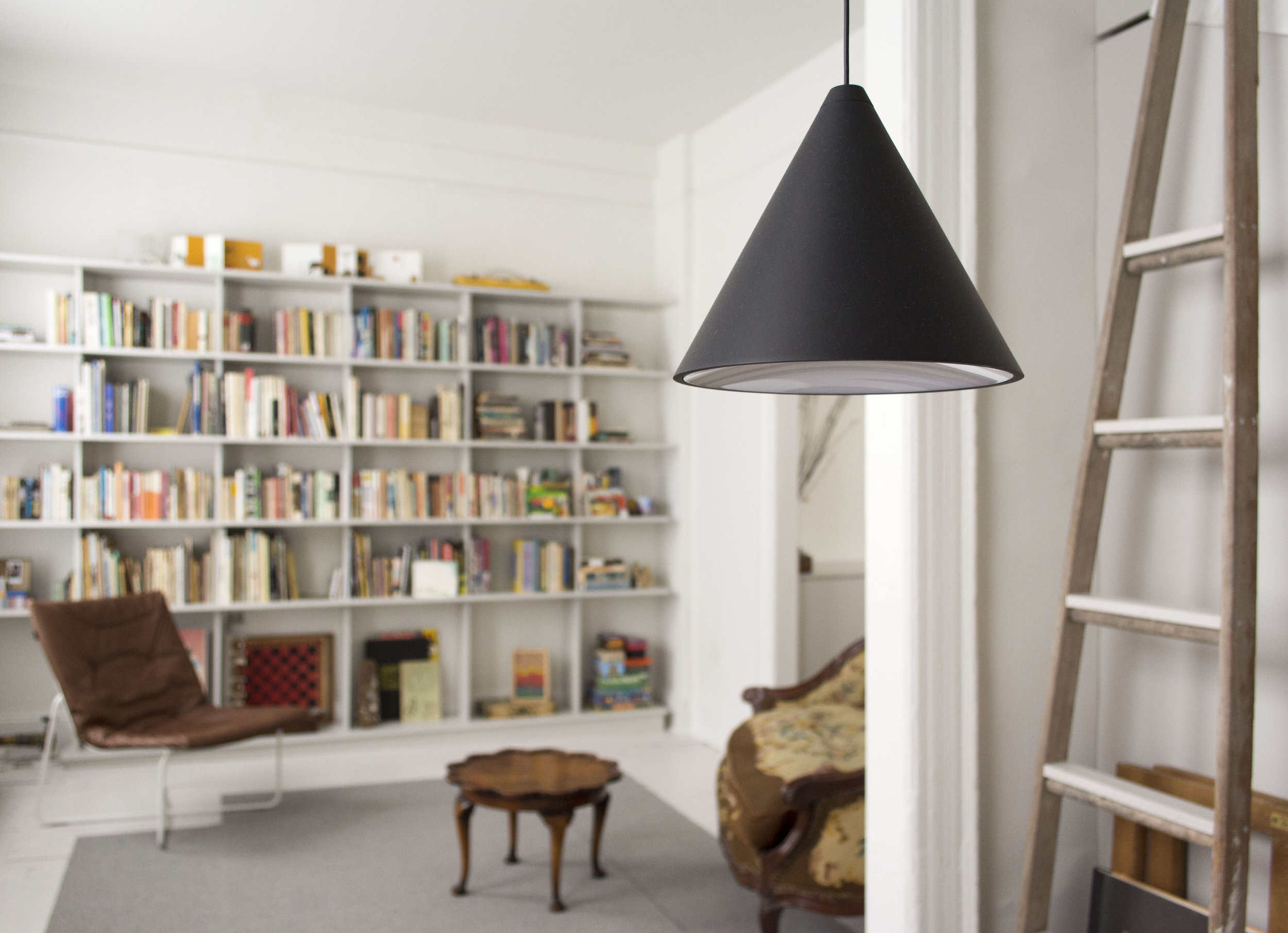
A new light grey color – inspired by the original grey floor of the office - unifies all of the new built-in elements: the bedroom loft unit, kitchen storage, bathroom cabinet, library shelves. Small hints of grey also spread to other minor details, such as the steps of the bedroom ladders. The daylight coming from three directions varies the gray hues subtly throughout the day and across the seasons.
Despite this rather neutral palette, retained original features give the home a strong sense of materiality. The existing plastered walls, with their rough surface and finish, were restored and painted in a matte light grey tint. The existing floorboards, although rough and unleveled (the slope is nine inches from end to end), were kept in their original condition.
A careful selection of fixtures and furniture also optimizes the use and flow of the space.
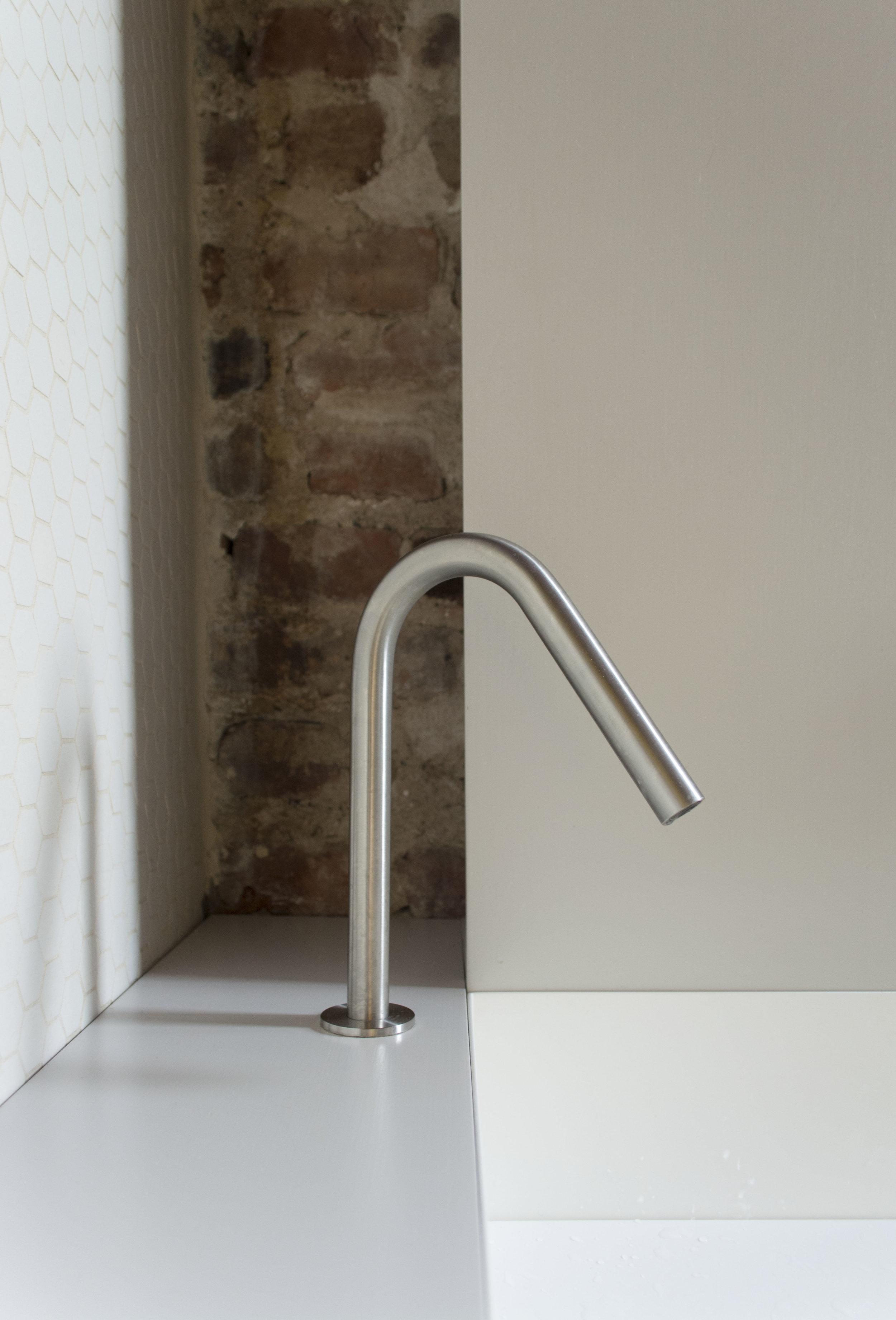
Custom cabinets, together with ADA-compliant kitchen appliances, allow the kitchen countertop to maintain a limited height - especially given the significant slope of the floor. The bathroom sink is large, yet thin metal walls keep it unobtrusive.
Two egg-shaped tables, curved back chairs, and a small rounded sofa allow movement to flow from space to space, unhindered by strong corners and volumes. The custom kitchen sink is large in width but subtly narrow in depth, with the faucet set on the side to minimize the volume; and a removable draining shelf adding functional flexibility.
Storage areas are hidden in plain sight, behind bare, light grey plywood panels, with no visible handles or hardware. Accessible from the side, these shelves contribute to the feeling of lightness and openness throughout.
Like hidden secrets, the plywood panels conceal storage where it is most needed: at the entrance, where keys and letters are left, behind the bathroom sink, as a reinvented medicine cabinet, and by the kitchen sink, to store cutlery and everyday implements.
The distinction between functions - eating, sleeping, working, bathing - is regulated by the careful design of thresholds and boundaries, sometimes permeable and transient, sometimes more definitive. It is remarkable to find in this limited space six windows, seven doorways and a different declination for each threshold.
The doorway between the living room and office is wide and open, and yet the floors change in color, keeping the identity of the two spaces separate but still permeable and symbiotic. The passage between the bedroom and the kitchen is low, deep and narrow, acting as a kind of “gate” that separates the spaces, while providing visual privacy to the upper bed loft. A doorway and an interior window, both original to the apartment, connect the kitchen with the living room. The window lets light flow through from the kitchen, without exposing the more formal living area to the cooking and dining spaces.
Within these rather small spaces, a complex narrative emerges through the alternation of low and tall ceilings, wide and narrow doorways, dark and light floors, dense and empty wall surfaces. The overall composition of space is also enhanced by the unfolding of multiple options to move from room to room, resulting in layered views and flowing circulation.
Exposed brick walls and a red tin bathroom ceiling remain untouched. Considering that the apartment is located on the 6th floor without an elevator, reducing transportation of materials was also a consideration.
… is bigger inside than out.
Michael Ende, The Neverending Story (1979)
Surface
420 SF
Rooms
Living Room
Kitchen
Office
Bedroom
Bathroom
Materials
3/4” Plywood
Stainless Steel
Fabric


